CLIENT
Mamaearth
PROJECT
Branding | Web Experience | Print Collaterals
We Illustrated Softness with Watercolour Warmth. That’s Mamaearth, By Design.
—


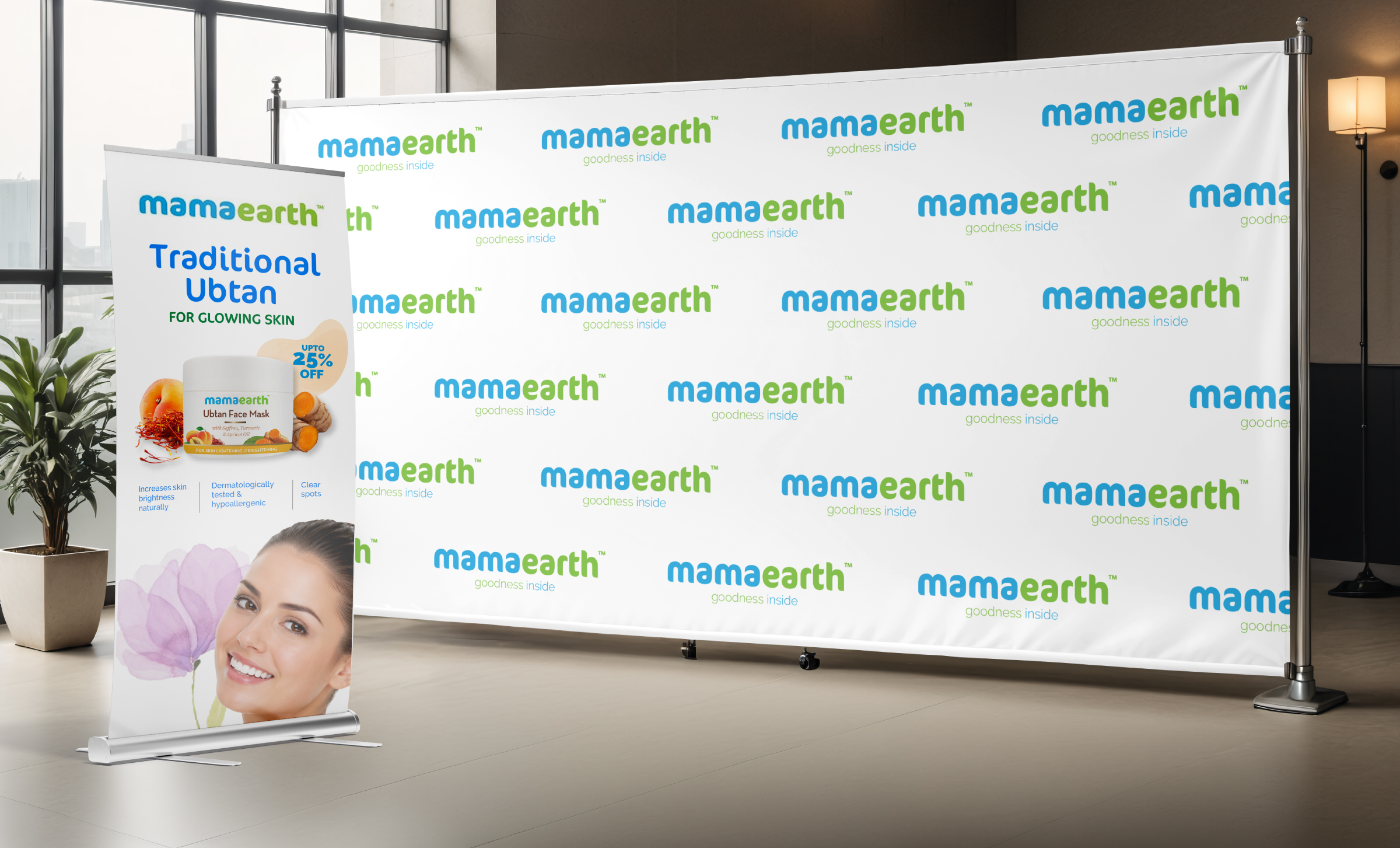
We used clean layouts and watercolour textures across all offline creatives. The design prioritizes white space, clear hierarchy, and legible type to make communication simple and effective.
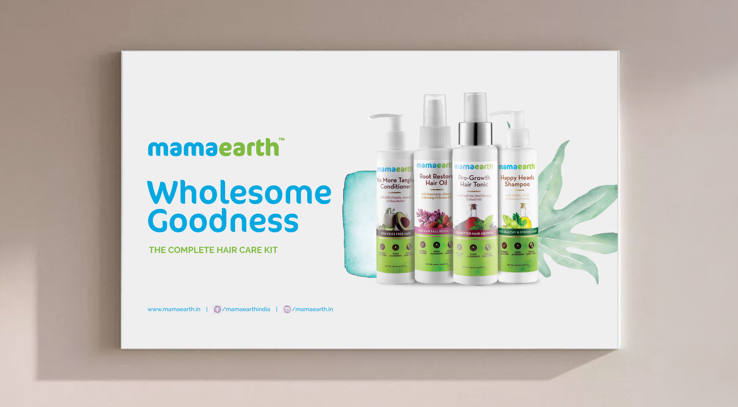
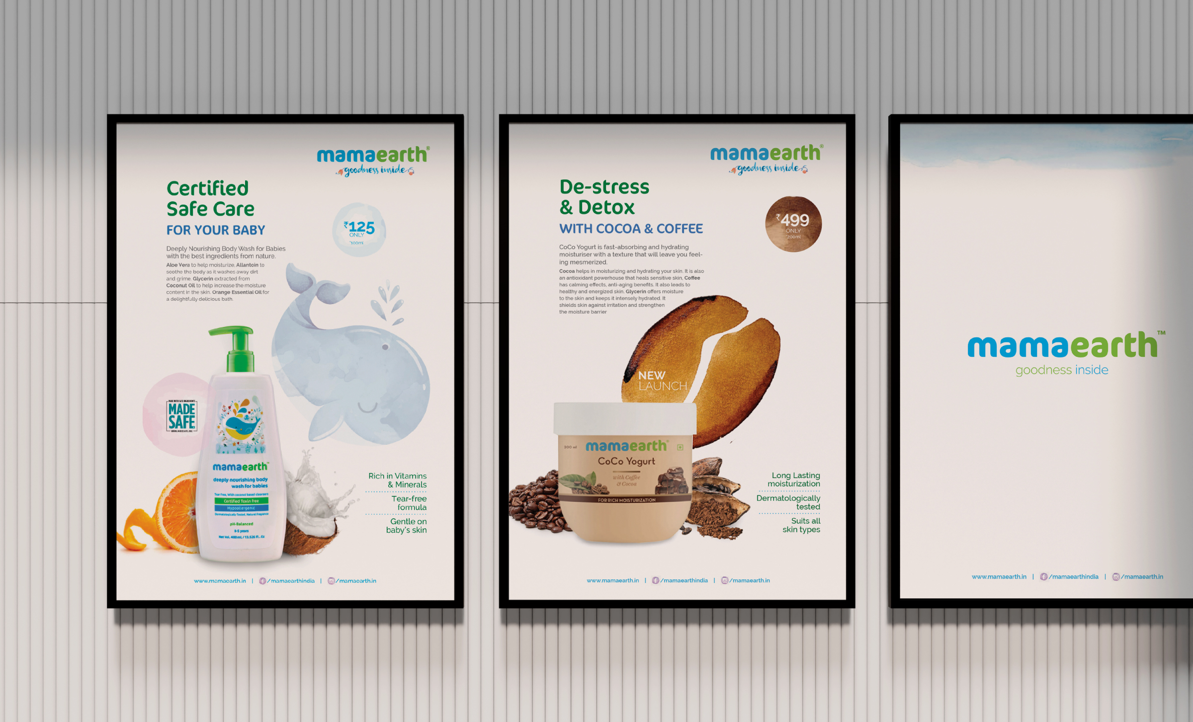

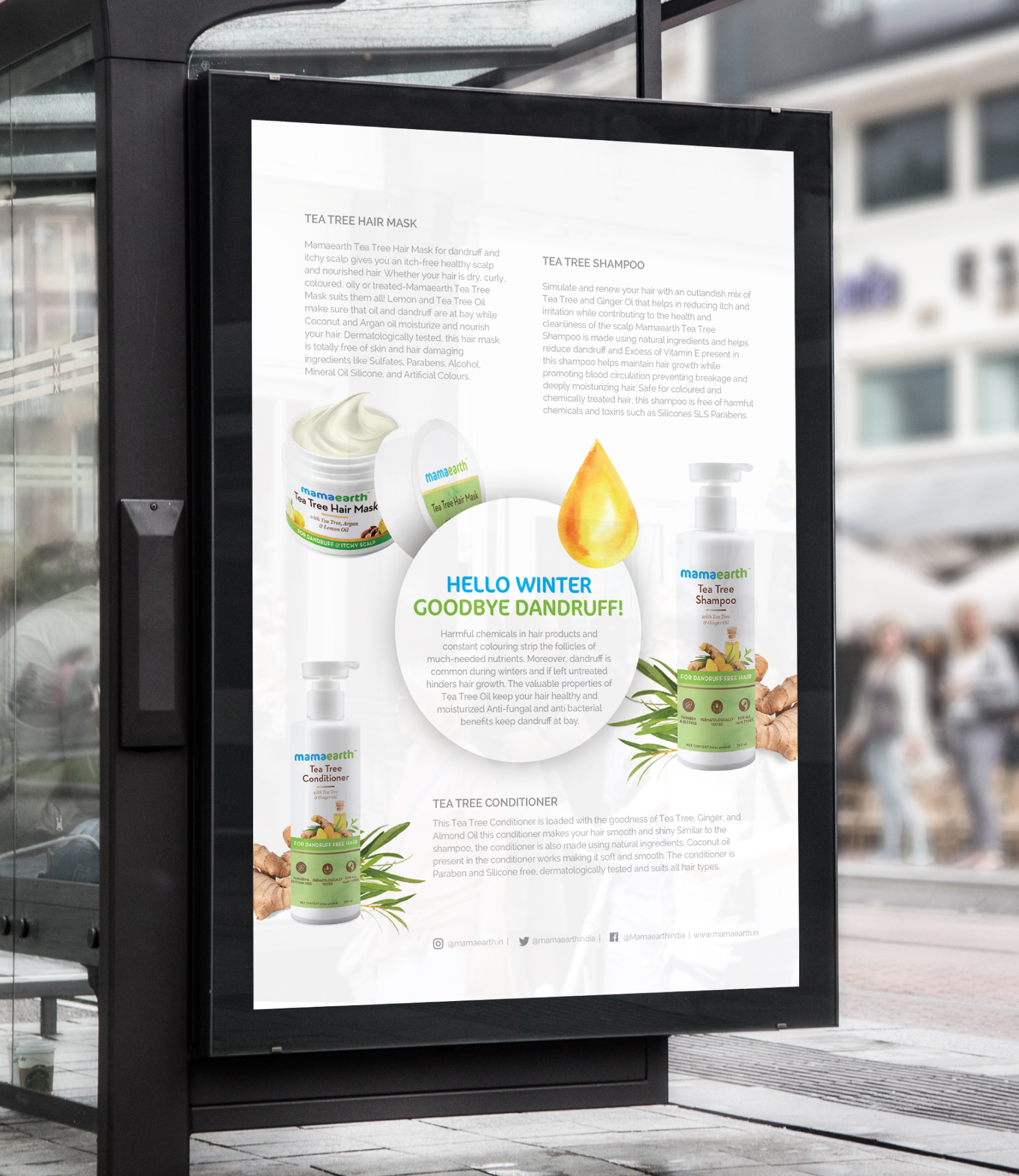
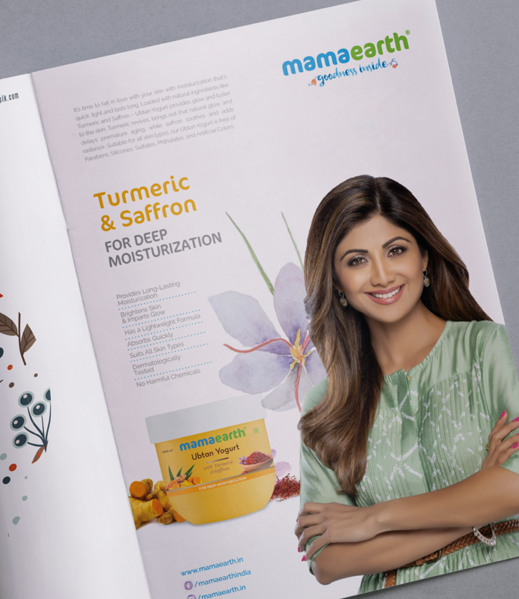

Same design system across backdrops, standees & merchandise-print. Simple grids, muted watercolour palette, and rounded type for clear brand presence.